
Tom Kubinski
Printing Consultant
tkubinski@sextonprinting.com
Direct: (651) 255-1225
Fax: (651) 457-7040
Cell: (612) 760-3700
 Mary Albers
Customer Service
mkc@sextonprinting.com
Direct: (651) 255-1255

 www.sextonprinting.com
250 East Lothenbach Ave.
Saint Paul, MN 55118
Phone: (651) 457-9255
Fax: (651) 457-7040
Toll Free: (800) 388-2914

Branding - 22 Laws Of
Brand Warfare
Creative Coatings Techniques
Desktop Techniques
Digital / Variable Printing
Direct Mail Raise Response, Lower Costs
Duotones-Tritones-Quadtones
FSC Certification
In House Mailing Capabilities
Ink Tour
Paper Mill Tour - Coated
Paper Mill Tour - Uncoated
Picking the Right Paper
PDF Formats
PDF Info & Quark vs. InDesign
Postal Increases & Requirement Changes
Post it to the Web vs. Print
Press Check Tips
Save Disk Space
Top File Issues
UV Burn
Ways to Save Money
What Sets Sexton Apart?
Why Work With TK?
|
|
March 2007 TK's Korner
Press Check Tips
Susan, was wondering if there was anything available for Tips on Press Checks. I'm glad to say, that there most certainly is. The info below will be from: Sappi's-"How to Read a Press Sheet" book, Potlatch's-"Potlatch Problem Solver" book, some very valuable input from various Press Operators as well as my own Two Cents Worth. Ok, we both know that I like to share a lot. So, lets go with my non-stop rambling. Ha Ha Ha.
To people outside our field, who simply look at pictures and only read words
, it may seem odd. For us, however, pictures are not passive: they're Tools used to convey ideas; which are affected by every shade, every nuance, every detail (or lack there of) that they contain. Logically, the degree to which we control this process determines how close we come to realizing our ideas.
Step by Step process to be done up front
- Establish communication with Tom Kubinski, your printer early on in the process
- Talk about specs, budgets, expectations and deadlines
- Most importantly, talk about the vision of piece, impact you want it to make, the look/feel you are going after, how the client is expected to feel when handling piece and if it is meant to be a one time view throw away or a high profile with a long shelf life.
- Discuss the actual design, images, techniques or anything special that you have in mind. Let Tom Kubinski know if you are open to options that may enhance your piece or give it that little something extra
- We want to make sure that what you have in mind can actually be engineered or find options that are available.
- Clearly, what you provide us from the start has the greatest impact on what you get back.
- Remember, that what works/doesn't for one project, doesn't necessarily mean it will/not for the next. Each project is unique in itself. By getting Tom Kubinski involved early on in the design stages, ensures that what you present and get approved will not come back at you.
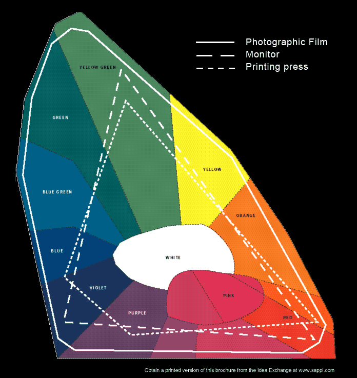
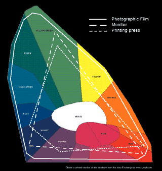 Original Images-your expectations on the color separations. Are you going for over all pleasing color or specific areas needing to match the original? Keep in mind the Compression Chart located on page 14 of Sappi's book, that shows what the human eye is capable of seeing versus what the camera/film can capture versus what the printing press is actually capable of producing. There are some colors that are more easily reproduced than others. Yet, mood settings/images will definitely require some considerations as well as discussing the proper paper selection. In addition, keep in mind that the line screen you choose will effect your final outcome. The more dots an image contains equates to a greater number of tones you can create as long as the resolution of the scanned image is high enough to begin with.
Design-Because offset printing involves physically putting ink on paper, where that ink goes, can have an impact on the things around it. IE Cross Over Hook Ups, Images above/below others, 4cp tint stripping-the amount of-size of areas-number of different 4cp tints etc will dictate if a solid PMS color may be a bet
ter choice. Mechanical ghosting: (ink is unevenly deposited in a particular area), is another concern that may creep into consideration. If preplanned, we can work the layout on press to try to eliminate the threat. If occurs while on press, you may have a few options to try.
Remember what's been designed and how it lays out on your computer may be entirely different on how it is positioned on a press sheet or signature. Virtually all of these situations could be avoided with advance planning and discussions with Tom Kubinski your printer early on in the design process.
Paper-has an enormous impact on the final printed results of your images-not only on their color, but on their sharpness, print contrast, level of gloss and detail! Variables to consider when choosing a paper: brightness, whiteness, smoothness, flatness, type of surface-gloss-dull-silk-matte-uncoated, the weight and it's opacity. Keep in mind that if you have or are planning on family member pieces, you need to keep all on the same stock. I have an excellent sample, (Flint Ink Color Quiz), that show the same PMS red color on 15 different stocks that looks as if there were about 10 different colors of red used. See also Picking the Right Paper Issue, Ink Tour, and Paper Mill Tour.
Coatings-Aqueous and varnish can not only protect the piece, but can enhance the images and add a level of tactile richness not otherwise possible. Your options for where and how to use these are almost limitless. In fact, I have a great binder with numerous one of a kind samples available to view upon your request. Note, that what you have done on one family piece, may need to be done to all. Otherwise, you run the risk of color variations even if you used the same images/paper. Keep in mind my issue that spoke directly to UV concerns as well. See UV Burn & Creative Coating Techniques.
Proofing-Due to the variety of options available, there is only one thing to keep in mind. None of them, however, can duplicate the final result perfectly. With that in mind and knowing what your final piece must look like, you are able to pick the most cost effective option. Sexton offers the following:
- Digital Dylux-used to check copy, size, positioning of artwork and Pagination etc. Ours is a CMYK backed
up proof that also gives you color designation. One could use this proof only for non-critical color projects.
- Match Proof
- Press Proofs-An actual printed piece using your images/stock of choice to see how they'll reproduce. Naturally these are more expensive and time consuming and should be used only when other methods can't simulate the effect.
Keep in mind that Sexton uses a CIP4 Cooperation for Integration of Processes system. This means that all the settings for color in our proofs are transmitted directly to the presses, which makes for faster and more accurate press checks. Thus, makes your job a whole lot easier as well.
NOTE-keep in mind that the cost of making changes increases significantly as the process moves along.
1) Laser stage, 2) Final Proofs, 3) Plates, 4) Press Proof
Marking up a Proof-Make sure that you are in a controlled & color balanced (5000K ANSI* standards) room when checking for color. The environment in which color is viewed can change it dramatically. There is a RHEM Graphic Arts Light Selector for Color Viewing available that helps you check to see if you are in a properly controlled room.
In addition, how well you articulate any corrections determines whether or not you'll get the changes you want. I recommend noting general statements about your wishes unless you feel confident in giving specific percentages and/or color moves. IE Brighter, Cleaner color, Skin tones too warm, Soften highlights, More definition, More Detail, Open up too heavy/dark etc.
Pressroom-By this time, you & I have covered all the bases, made the necessary changes/corrections. This means the press ok should go fast, fun and uneventful. What to do next:
- Make sure you have all supporting materials on hand. IE Dylux's, final color proof, companion pieces etc. It's best if you give me your companion pieces up front with any specifics so the press operator can start with your end goal in mind.
- Establish a rapport with your press operator who really understands their press capabilities and how to get what you want.
- Reader Sheet-a make ready sheet that's not for color but can be used for proofing content.
- Check copy changes noted on dylux
- Check design elements
- Check positioning of art & type
- Lastly, check
stock--paper, weight and finish
- Sheet Two-
- Mark sheet #1 and number all following to track your moves.
- Check print quality.
- Over all color and balance
- Flesh tones
- Registration
- PMS color to book
- Type-Crisp edges-any Broken type-Clean knockouts
- Check for hickies-dirt or scratches
- Check for consistent densities across page. Especially when you have cross over hook ups etc.
- If you find areas of concern, be sure to circle and draw a line out to white area of the sheet so it doesn't get missed by getting lost within art.
Note-take your time on this sheet. Don't try to do it all at once. Step back and get an overall view, impression and feeling. Compare the sheet to your color proof and understand where a give and take may be necessary. Speak in generalities about adjustments so the press operator can decide what the press actually needs to do to get there. Unless you are confident in making specifics.
Note-keep in mind the difference between your proof material (its brightness, whiteness and coating) compare to your printed stock. These differences will dictate what may/not be obtained on press.
- Subsequent Sheets-
- Continue to mark sheets in numerical sequence.
- Double check previous ad
justments (where you've been).
- Check tints-with each color move they may have shifted.
- Check side to side-similar colors especially cross overs.
- Confirm areas that get/not coated, quantities, version differences etc.
- Finally, make sure that any changes you've made have not changed other critical areas due to the signature layout.
Note-Don't be afraid to cut or fold sheets so you can lay them next to one another-IE especially important with cross over hook ups
Note-for those seasoned press checkers, the color bar area has a lot of excellent info to use to your advantage. Pages 24 & 25 in the Sappi book has an excellent description of each.
- Sign Off Sheet-When you like it, sign it. If there's a chance the piece may reorder, ask to have it recorded.
Special Notes-For some colors, even the smallest variance can shift the color significantly. The industry standards are 5-6%. However, for some PMS colors and 4cp tints, a 3-4% variance can have a profound effect. Your neutral grays, purples and colors that have a lot of transparency color in them are the biggest culprits.
Potlatch's Problem Solver-Trouble Shooting;
Don't forget that proofing materials will look different than the printed piece. First check the whiteness, brightness, gloss etc of your proof material to your projects stock. That wi
ll tell you a lot right from the start. Even the coatings will effect your final outcomes. IE a yellow stock to proof material will mean that your colors will be yellower, glossier proof and no coating on piece may mean colors are not as rich or vibrant etc.
- Hickies-occur when particles adhere to the plate/blanket, causing either a donut effect or an unprinted void surrounded by printing.
- Solution-dip out ink fountain-drop fountain blade & clean, hot water wash rollers, add fresh ink from a new can, change inks
- Pick outs-ink is too tacky or coating is defective causing stock to be pulled and deposited onto the blanket. Subsequent sheets show partial filling or absence of color.
- Solution-clean blankets, change inks, reduce ink tack, reduce impression cylinder pressure, try different grade of stock
- When ink builds up on the blanket until it eventually lifts off a portion of the image, pulls the fibers or coating from the sheet
- Solution-try different lot of ink, adjust fountain solution levels, replace blanket or try different grade of stock
- Delamination-when pap
er itself pulls apart during printing.
- Solution-reduce ink tack, back cylinder pressure or try different grade of stock
- Misregistration or Slur-printing dots don't align causing a blurred image or color variance.
- Solution-adjust & clean grippers, lower ink tack, re-adjust feed table, try different grade of stock
- Mottle-when ink lies unevenly on the sheet or in a solid area
- Solution-For 4cp-reverse cyan-magenta ink sequence tack Accordingly Put heavier coverage down last & solid colors in last unit, increase press speed, try different grade of stock.
- Wrinkles-the only solution for this is to set paper aside and try a different grade of stock. Usually a heavier stock or not to coat may be the answer.
-
I hope this gives you some tools to use at your next press check and please keep the recommendations for subjects to be covered in future issues coming.
---------- cut here to take with you -----------
1) ___ Supporting materials, bring all with you - companion pieces, sign offs, etc
2) ___ Look at Final proofs & Dylux
3) ___ Number all Press sheets in upper right hand corner consecutively with the changes you are making
4) ___ Look at overall color to see if ok or needs adjustment
5) ___ Make general color adjustment comments so operator may adjust according to where the press has been & can go - IE flesh tones too warm/jaundiced looking whites are too dirty
6) ___ If Cross overs are present, check color consistency of different positions
7) ___ If using 4 color process Tints, check color consistency throughout
8) ___ If PMS colors being used, check against PMS book or color chip
9) ___ Check Registration marks if color is not adjusting property
10) ___ Check for hickeys or picking before final sign off
11) ___ If Coating with varnish or aqueous, check for registration and smooth application.
12) ___ If Mailing & using a coating, is a knock out necessary for ink jetting, lasering or written information?
13) ___ Sign off when all looks good, make any last minute notes on sheet for operator to watch/do while getting up to speed on press and ask for the number of press sheets you'd like to take back |
Referrals are greatly appreciated. If you know someone who I should contact, please let me know.
If you would like to join me on one of our upcoming tours, if there is something that you would like me to address, or if you know of someone who might like to receive TK's Korner, please let me know via e-mail at tkubinski@sextonprinting.com or phone. Take care and have a great day.
Successfully,
 Tom Kubinski-Printing Consultant Tom Kubinski-Printing Consultant |
 Original Images-your expectations on the color separations. Are you going for over all pleasing color or specific areas needing to match the original? Keep in mind the Compression Chart located on page 14 of Sappi's book, that shows what the human eye is capable of seeing versus what the camera/film can capture versus what the printing press is actually capable of producing. There are some colors that are more easily reproduced than others. Yet, mood settings/images will definitely require some considerations as well as discussing the proper paper selection. In addition, keep in mind that the line screen you choose will effect your final outcome. The more dots an image contains equates to a greater number of tones you can create as long as the resolution of the scanned image is high enough to begin with.