|
  
Michelle, a client asks, "How do you set up Duotones?"
And another, Todd, wonders, "What are my options for proofing Duotones and why do they look different when on press?" Well, they are not alone and it has been difficult to understand these techniques much less visualize their effects.
It is important to realize, for example, that duotone effects can vary considerably, dependent upon the intensity of color showing through, thereby giving a different effect without a change of ink.
 There is no doubt that the printed effect can be changed endlessly, either by manipulating the tonal scales of each halftone, or by utilizing different inks and paper. The combinations are many, and each changes the effect slightly. There is no doubt that the printed effect can be changed endlessly, either by manipulating the tonal scales of each halftone, or by utilizing different inks and paper. The combinations are many, and each changes the effect slightly.
For example, the combination of certain inks will sometimes change a color. Yellow and black often become brown in appearance. Yet, no matter how important ink is, it is only as good as the paper it's printed on. Thus, there will be a difference when you print these effects on an uncoated versus a coated sheet. Let's not forget the line screen either!
With all this said and done, let me take you down a proven path that has produced great results and given many an excellent idea of what they will get when on press. Step 1:Scan your image(s) as four color to capture all the values. (If you only scan as a halftone, you'll lose many values that can take your image or design to the next level.)
Step 2:Convert your image(s) to grayscale.
Step 3:Group all images into three different categories; Dark, Medium and Light images.
Step 4: Select your Primary or Dominant color as well as your Highlight or Secondary color. In this case, we are using Pantone PMS 300 and black. Step 5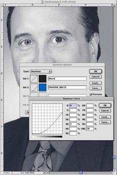 Create your Bell Curves for the Primary & Secondary colors. (Note - you will want to create a specific Bell curve for each one of the groupings or your Dark, Medium and Light images.) It is best if you keep the curves as normal as possible; meaning curves and not zig zags. By having a master curve, you have created a look that now can be manipulated to fit the image better without recreating it from scratch for each image. In addition, you will have a better chance of keeping them similar throughout the piece. Create your Bell Curves for the Primary & Secondary colors. (Note - you will want to create a specific Bell curve for each one of the groupings or your Dark, Medium and Light images.) It is best if you keep the curves as normal as possible; meaning curves and not zig zags. By having a master curve, you have created a look that now can be manipulated to fit the image better without recreating it from scratch for each image. In addition, you will have a better chance of keeping them similar throughout the piece.
Step 6: Drop each image into the curve that it belongs to. If you don't like the result for that particular image, it is ok to make adjustments for each image by changing the curve in the Highlights, Mid-tones and Shadows.
Step 7: Proofing: Before we discuss your options, it is important to state that you have been viewing these on an illuminated RGB monitor and now will be going to a CMYK printing format. There will be differences right off the bat.
You have the following choices:
The least expensive (and least accurate), is a Laser proof on uncoated paper - Then comes an Epson™, etc.
- The contract matchproof or KODAK Matchprint will get you closer, yet is still a CMYK version.
- Going to film outputs and having a DuPont™ Cromalin® made is your best choice other than a Press proof (which is usually cost prohibitive). A Cromalin proof is ink toner that can be mounted onto the actual stock that you are going to print on. When going this route, it is wise to have all images put up on the sheet at actual size and have enough toner made of each color for at least two sets of proofs. (These proofs are charged out on the amount of material and mixings, and since you will probably make adjustments after viewing the first, you will at least save on the additional mixings.)
Step 8: Now that you have the proofs all approved, you're ready for the Press check. Keep in mind that there still will be a variance of what you'll get on press versus what your proof has shown you. But, you'll at least have a better idea of where you'll turn out
These steps may be taken for Tri-tones and Quad-tones as well. Yet, each subject, PMS color and stock will dictate what additional steps will be necessary. Quad-tones look best on coated paper via Stora Enso's #2 ED. Just like most four-color images. That's because the hard, relatively non-porous surface of coated paper holds each halftone dot precisely without allowing it to run into other dots or be absorbed into the capillaries of the paper.
This superior dot hole out and reduced dot gain means that each layer of ink can precisely filter the light that strikes the surface of the paper and reflect back clean, un-muddied colors and tones.
Other images, especially those that have faded or been made from a print, often have poor tonal ranges. Printing them as quad-tones can expand the range of tones and add an antique quality to the image.
Adding yellow to highlights accentuates the glare of the sun. Increasing the density of all colors in the mid-tones and shadows adds to the contrast of the image and makes the sunlight even stronger.
Application of cyan, magenta and yellow under the black ink can serve to identify shadow areas of an image
Using magenta on mid-tone areas could help add extra warmth to a portrait, while using cyan in highlights and mid-tones will give the image color and feel.
Also, it is important to mention that Metallic inks do gain and spread, which will require you to pinch, back the dots accordingly.
Pantone has an excellent tool available - Doubt-Free Duotones that actually has a wide selection of Bell curves already created for you to simply drop in images. It is a five-CD set providing access to 11,000 Adobe Photoshop duotone curves for over 900 Pantone Colors. You can call them at 1.866.PANTONE or visit their web site at www.pantone.com. While there, you may wish to view all the other tools they have available. Another fun and exciting tool, is from Sappi called - Choices. I have scanned it in to give you an idea. See it here at Choices. They have taken one image and broken it down to sections that represent a CMYK quad-tone. Each section has then been detailed out for you on how it was created in the Highlights, Mid-tones and Shadow areas for each CMYK percentage. I do have this available to show you if you are interested. Just give me a call and we'll get together.
You can also check out my profile, join my network and view more client comments on LinkedIn at ŌĆō http://www.linkedin.com/in/tomkubinski
Remember,
It's Just Plain Fun to Say - 'K U B I N S K I !'
Referrals are greatly appreciated. If you know someone who I should contact, please let me know. If you would like to join me on one of our upcoming tours, if there is something that you would like me to address, or if you know of someone who might like to receive TK's Korner, please let me know via e-mail at TKubinski@shapco.com or phone.
|