
|
September2024
Using Desktop Techniques to Your Advantage

In this month’s issue, I’d like to provide some helpful ideas on specific desktop techniques and help you better understand what works versus what doesn’t.
CREATING DROP SHADOWS
Other applications now have the capability to create drop shadows around elements and type. Most of them create drop shadows by generating a raster grayscale image. One of the things to look for is the resolution of the drop shadow image. In the latest version of QuarkXPress® you can control the raster settings by editing an Output Styles Transparency Options. Adobe® InDesign® lets you control the raster settings by editing or creating a new Transparency Flattener Preset.
CREATING VIGNETTES (or Gradients)
Vignettes (gradient blends) have been huge headaches in the past. Strange patterns, banding and hard breaks were some of the more common issues. These were primarily due to the limitation of the Postscript language — in its ability to produce only 256 levels of gray. To overcome these problems Sexton came up with some workarounds such as creating the vignette in Adobe® Photoshop® and adding “noise” or “blurring” effect. But, since Sexton installed in the Kodak Prinergy PDF workflow in 1999 (which is based on Adobe PDF Print Engine), those pesky workarounds are no longer necessary. Now when you create a vignette in Adobe® Illustrator®, QuarkXPress® or Adobe® InDesign®, Prinergy will use “smooth shading” to produce better and more efficient vignettes. Smooth shading reduces banding by having 4,096 levels of each colorant in gradient fills.
When creating a vignette, keep in mind the size of the area you are creating it in. For example, with a starting point of 100% color blending to 0% color, a vignette created in a small area will most likely have banding occur, no matter what one does. But, the same starting point and ending point of color will have a much smoother appearance if the gradient is created in a larger area — allowing space for the blending to occur. 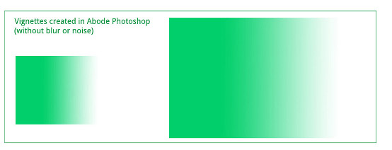
If you have any questions, please give me a call so that we can address any concerns up front, which will save time, money and headaches!
CREATING RICH BLACKS
1. Create a “rich black” color for Digital Printing by using a formula of 40% cyan, 30% magenta, 30% yellow and 100% black..
Or create a “rich black” color for Offset Printing by using a formula of 40% cyan, 30% magenta, 30% yellow and 100% black.
2. If there is an open ink unit on the press you can have a double hit of black ink in the desired area, which would provide a deep black color.
3. Or, you can add 30% magenta (for a warm black), or 30% cyan (for a cool black) under the black. You can also use this philosophy with a two-color job by adding 30% of the spot color under the black. (NOTE Please contact me when these situations arise so I may consult you on which option would be best as well as what areas we should address.)
OUTLINING IMAGES
In Adobe® Photoshop® you will use the Pen Tool, which is a similar tool in many of your favorite drawing programs. Before outlining it is best to view your image at a 200%+ magnification. With the Pen Tool start by clicking 2 to 3 pixels into the image area you are outlining. This will assure that you will not have any of the image background showing. If you are going to delete the background to white, make your selection after you have saved your working path and feather it 2 pixels. This will provide you with a softer edge. Sometimes images will have cast from the background or surrounding area. You can remove this by cloning it out or by using the sponge tool with the desaturate option and adjusting the pressure and brush size.
For more information, visit the official Adobe® Photoshop® homepage at http://www.adobe.com/products/photoshop/family/
I hope these recommendations for desktop techniques has helped. Remember to have FUN, and not headaches!
Before we go... If you have a production issue not discussed above that you would like me to address, or a project that needs to be looked at, please give me a call or send me an email. As always, I will do whatever it takes to ensure you receive the best value for every marketing dollar you invest. Connect with me on LinkedIn You can also check out my profile, join my network and view more client comments on LinkedIn at: http://www.linkedin.com/in/tomkubinski Referrals are greatly appreciated. If you know someone I can help, or who might like to receive TK's Korner, please let me know. Take care and have a great day!
Successfully,
Tom Kubinski Printing Consultant Who Helps You Make Good Impressions TKubinski@shapco.com

Take a Virtual Tour of Shapco
Shapco Website to know more
Explore Our Unique Selection of Trade Show Products
Make sure to check out the latest TK's Korner issue
SOC2
Our Services: Advertising Specialties, Large Format, Full Service Mailing, Fulfillment / Inventory Management, e Commerce Portal, Offset Printing, Digital Printing, Packaging, Kitting etc.
Our Work: Advertising Specialties, Books, Packaging, Digital, Large Format, Booklets, Brochures, UV Offset, Direct Mail, Specialties, Menus and a whole lot more
Why Shapco: "If You Dream It, Shapco Can Print It. What can Shapco do for you?"
Did you miss an issue of TK's Korner? Click below to view!
|
Tom Kubinski
www.shapco.com 
|
 There are unlimited ways to create drop shadows (and vignettes), but I would like to guide you to more favorable techniques. When you create a drop shadow in the CMYK mode in
 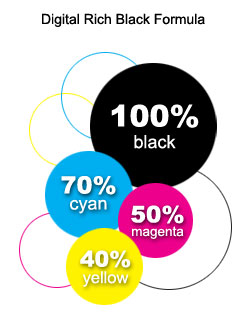 There are many designs that require a large area of black. In order to achieve a nice, dark, rich looking black we need to pump a lot of black ink onto the printed sheet. This can cause many undesirable results: Process photos, duotones and halftones can end up looking muddy, heavy or plugged. Or, if we do not pump up the black ink, we are left with light, muddy or dull black colors, images and type. Creating a “rich black” can solve a lot of these issues up front.
 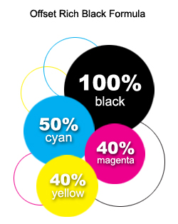 Simply add a color swatch to your software color palette, using the name Rich Black and using this CMYK formula. Then, select those heavy areas of black and designate the “rich black” color swatch.